Have you ever looked up the Price-to-Earnings Ratio (P/E Ratio) for a stock ticker, only to find it is ‘N/A’ or blank? What about seeing a stratospheric P/E Ratio of say 400? Here you thought you were doing some due diligence on a stock recommendation that came your way. You wanted to know if the stock is ‘expensive’ or ‘cheap’, but you hit a dead end.
Sometimes when this happens there’s a better option, and it is right in front of you – in The Upside Down.
An Example
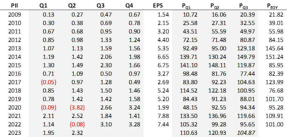
The formula for P/E Ratio is simple, but there’s a little bit more to it than meets the eye. Yes, it is a stock’s price divided by its earnings. The numerator is easy enough, just take the current price or the last closing price. But the denominator is what, four times the most recent quarter’s earnings? Nope, and the reason is simple. Let’s take a look at the earnings of today’s brand-new addition to the Royal Dividends portfolio, Polaris Inc [PII].

Polaris Inc’s earnings typically grow as the year progresses, the second half of the year almost always being greater than the first half. It is the nature of their business. Many companies have a certain seasonality to their earnings and for this reason the earnings that go into the P/E Ratio should be representative of an entire year. Even in the absence of seasonality there are always the vicissitudes of doing business, aberrations in performance, or the timing in the recognition of earnings that make using any one quarter as the foundation for a calculation problematic. Now, one could certainly use the most recent calendar year in an attempt to eliminate any unwanted effect of seasonality on the calculation. However, depending on how well into the current calendar year we are, doing so could leave out as many as three quarters of more recent, more relevant earnings information.
And so, the most common calculation of P/E Ratio has as its denominator, the trailing twelve months of reported earnings1. Since nearly every company reports quarterly, this amounts to the four most recent quarters.
Thus, as of close September 25, 2023, the P/E Ratio for PII is [104.87/(3.10+3.28+1.95+2.32)] = 9.85.
The Utility of P/E Ratio
Most everyone looks at P/E Ratio as a snapshot, a point in time comparison to gauge whether a company seems like a bargain or not. For instance, a stock with a P/E Ratio of 45, trading in an industry with a current P/E Ratio of 22, in a broader market where the S&P 500 Index is said to be trading at a P/E Ratio of 21, could be seen as expensive. There may be good reasons and reasons require digging. But it is an indicator that the stock has become overbought. On the flip side, a company with a P/E Ratio of 8, with a slew of competitors all above 11 with an average of 16, could be seen as a bargain. Maybe it is. Or, maybe the market perceives serious headwinds.
Comparing the ratio to that of a company’s competitors, industry, and the market in general is a good idea, but there is a way to increase the utility of the P/E Ratio. Compare the stock’s current P/E Ratio to its past. I learned this from Sure Dividend and they provide a 10-year history in their quarterly report for every ticker in their database. It gives you a feel for the range in which the stock has traded over the years, how consistent the ratio has been, and whether or not the current level is extreme in either direction. A snapshot is a great place to start but getting your hands on the historical movement of the P/E Ratio may prove valuable.
Uncommon Denominators
What if a company hasn’t made money over the last four quarters? As a result of the pandemic, Polaris took a beating in the first half of 2020. Polaris, a company operating in the Consumer Discretionary sector, producing and selling high-priced recreational vehicles, would be exactly the kind of company to suffer in a recession. At any point in the third quarter of 2020, one would have found their P/E Ratio to be blank or ‘N/A’. Of course, it is a simple matter to calculate a P/E Ratio with a negative denominator, but the result, necessarily being negative (because the stock price for a going concern will always be positive), is meaningless and useless. If a P/E Ratio of 20 is to be interpreted as ‘investors are willing to pay $20 for every $1 of earnings, what does a P/E Ratio of -20 mean? No investor is collecting $20 to acquire stock in a company. Well, not without selling an option – but that’s outside the scope of this post. There are some very popular stocks that never have a P/E Ratio, because they have never made money. But oh boy do people love to pay for those stocks. Think Peloton [PTON] and Roblox [RBLX] and …
Polaris is a great example of a company that typically makes money. After all, they have a 28-year dividend increase streak going. So, it is relatively uncommon for them to lose money in a single quarter, let alone a year.
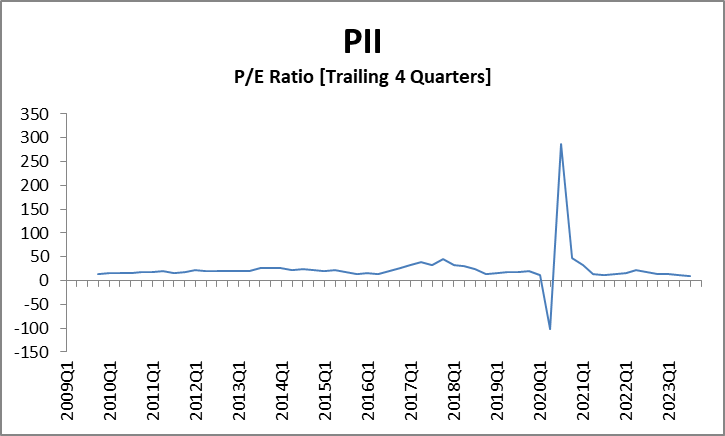
Equally uncommon for such a strong company is to make just a little money. The third quarter of 2020 was decidedly profitable and the trailing four quarters went from negative (-0.91) to slightly positive (0.33). What happens when you divide a relatively large numerator by a relatively small denominator? You get extraordinarily high and yet, still meaningless numbers. At the end of the second quarter of 2020, PII was selling for $92.55, three months later, $94.34. The P/E Ratio went from -101.70 as calculated to 285.88. Are we to believe that though the price barely changed, PII was grossly overpriced as suggested by the P/E Ratio even though the earnings were now looking more encouraging? The chart below shows what the P/E Ratio looks like in these relatively uncommon circumstances.

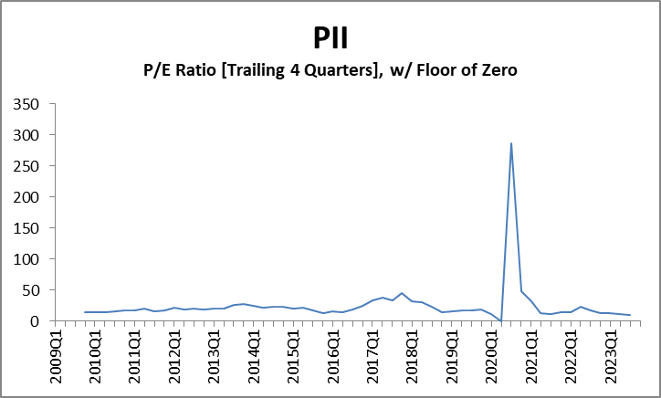
When negative P/E Ratios are not allowed, the graph is less compressed, but still we have a problem.

Let’s be honest, this chart is useless. All it takes is one instance of very low, but positive earnings to temporarily send the P/E Ratio to absurd levels, and in so doing, compress the historical line to a point where it offers no discernable information.
Earnings Yield
Folks, even when I find the P/E Ratio useful it strikes me as unintuitive. When a $100 stock pays a $4 dividend, we don’t say it has a P/D Ratio of 25. We say it yields 4%. Turn the P/E Ratio upside down. Effectively, we now have E/P Ratio – what some call an Earnings Yield. Earnings yield puts the larger, always positive number, in the denominator. A ratio with a larger, always positive number in the denominator does not have the same problems as P/E Ratio. It is not thrown into convulsions when a full year’s worth of earnings oscillates around zero. It is mathematically resilient and superior.
And no one talks about it.
No one can say with certainty what a company will earn in the future, or where the stock price is going. But the chart above displays the historical relationship between earnings and price for Polaris, wonderfully, and with no adjustments. The last four quarters for Polaris have been their most profitable of all-time. This is easily seen from the earnings table that has to be compiled to produce the E/P Ratio chart2. And trading at $104.87, it seems Mr. Market has slapped a 25% discount on PII from his price tag just 40 days ago. Sure, we had a good feeling that PII was at a favorable price when we saw the P/E Ratio fall under 10. The market fears PII will perform poorly in a recession. Fair enough. But the historical E/P Ratio says wait a minute, look at me. This is the most bang for your buck you will have received in the last 15 years. You cannot easily see that in the P/E Ratio charts. Further, we know that yes, the price has dropped, but this is not the whole reason for the elevated Earnings Yield. There is also the matter of the earnings being at their highest level ever happening at the same time.
That’s the perfect storm, the kind you want to see roll in from afar on a beautiful summer night over grassy hills on the porch of the home you grew up in. And when the skies break – it rains money.
1A thorough treatment of just what reported earnings are and why no two sources for a given stock seem to match over an appreciable amount of time is a matter for someone with a passion. This would not be me. Suffice it to say that I found a good source in macrotrends.net. They possess quarterly data going back to 2009. But they are not perfect. Regardless of the source(s) you use, try to understand what it is you’re looking at.
- Have the prior earnings been re-stated over time or left alone once initially reported?
- Are they earnings as reported (GAAP earnings) or have they been adjusted or normalized for certain one-time events?
- Do the quarterly earnings sum to the totals provided by the same source?
- Have the historical earnings been adjusted for acquisitions, stock splits, split-offs, or spin-offs?
- Are you looking at the earnings of a REIT? For purposes of finding a good P/E Ratio, you’re better off using FFO (Funds from Operations) or AFFO (Adjusted Funds from Operations).
Sometimes one source will match another source in long-ago periods, but somehow diverge in more recent times. More likely, it is the opposite. Reconciling one source to another may be a matter of answering the questions above, or more likely, will remain a mystery. The most accurate sources will be the company’s own investor relations webpages and the SEC’s own website, but they’re also the least layperson-friendly and brutal to use if you’re after multiple years and companies. Rather than pull from multiple sources, try to find one good source for a stock’s complete history to stay consistent.
2Some sites provide a P/E Ratio graph, but unless you also have a data table and it hasn’t been blanked for negative earnings, there is no easy way to invert the information to produce the E/P Ratio chart. One has to get dirty and find quarterly earnings and quarterly price information.
