
As of market close on 2025-11-10, the ten largest tickers by market capitalization within the S&P 500 Index [SPX] represented a staggering 43% of the entire index. That’s a first in the history of the index which goes back to the late 1950s. That’s right, never before has just 2% of the tickers comprised over 43% of the Index value.
What does that concentration actually look like?
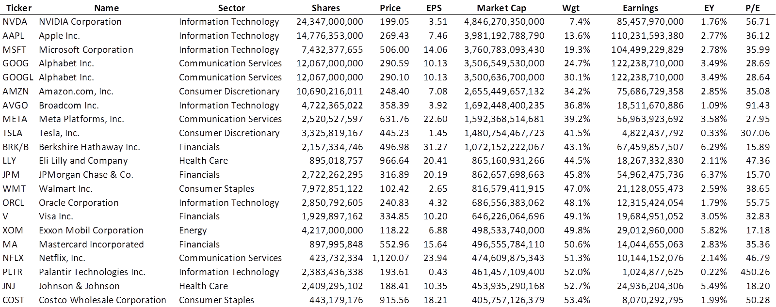
Note that the first ten tickers represent only nine companies as Alphabet Inc has two classes of shares available in equal number1. These also happen to be the nine companies that exceed one trillion in market cap. I chose to show the first 20 companies (21 tickers) because it includes some big names and also to reveal at which point you’re dealing with more than 50% of the index, which happens with Mastercard [MA].
The EPS numbers are the trailing twelve-month earnings ‘as reported’. These, I suppose, would be the GAAP numbers that most investors tend to ignore, preferring instead to track the adjusted non-GAAP numbers that tend to remove the impact of certain one-time events that could otherwise obscure a quarter’s performance. EPS is also not the best number for REITs and MLPs either. But at the end of the day, this is what was readily available via Schwab’s ThinkorSwim scan application2.
Relative Value Scale3
P/E ratios were what I was interested in this deep dive into SPX. I had seen the chart below and wondered just how much the Magnificent Seven are causing SPX to look so overvalued.
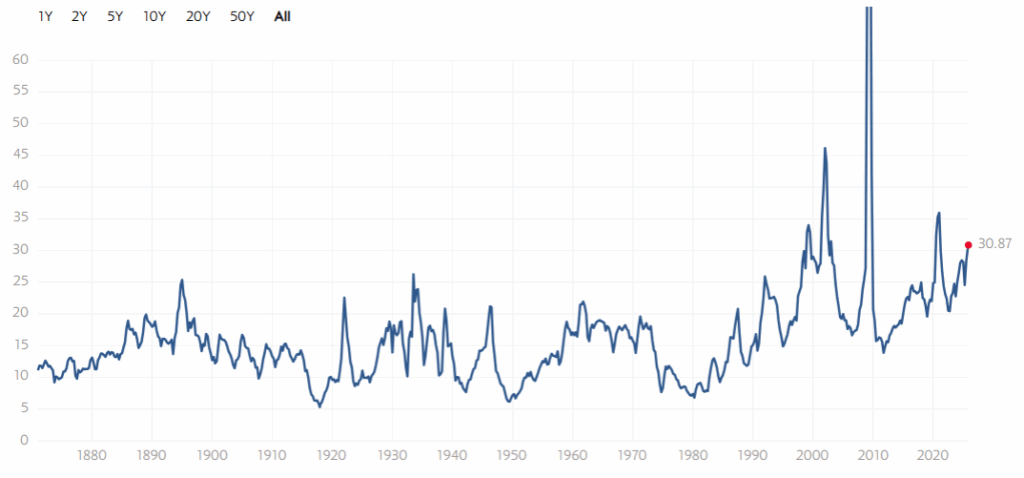
Sure, the P/E ratio is higher than at any point in the first 120 years4, but at least it is only twice the historical average.
It turns out, it is not easy to assess the impact of the largest companies on the P/E ratio of SPX. Apparently, no one publishes the P/E ratio for SPXEW or equivalent ETF that might mimic the equally weighted S&P 500 Index.
So, I calculated it.

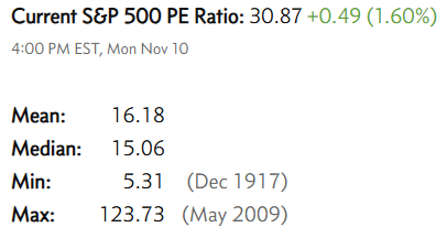
There is a discrepancy whereby my P/E ratio of 29.59 is lower than the one published above at 30.87. However, their site makes it clear it is an estimate. I am satisfied that they are pretty close.
We find that the nine largest companies (10 tickers) are trading at a P/E ratio over 36 and we know it isn’t Warren Buffett’s fault <ahem Musk>. The Forgotten 490 is trading at a relative value of .7069 (25.85/36.57), a near 30% discount to the Neoplastic Nine.
The problem of course is that a P/E ratio near 26 is 60% more than the historical mean. This doesn’t quite feel like a bargain.
Why care?
Well, care is a strong word. This was my attempt to prove out some of what I had been reading. Things like “Nvidia Corp [NVDA] has become the first $5 trillion company5” (it has since fallen off a little), “the Mag 7 is 30% of the Index”, “NVDA would be the seventh largest sector” (see 2025-07-18 post), and other click bait.
Further, I wanted to answer the question of what the P/E ratio would look like if all of the stocks were the same size. I didn’t like the answer. Yes, the largest stocks are pushing the ratio up about 4 points or 17%, but it doesn’t mean the smaller 490 stocks are attractively priced. They, too, are overvalued.
But there are a few things to take away from this post.
First, there is unprecedented concentration in SPX, and it does present a risk. How many 401(k) accounts will tank in the event NVDA, or a couple of the others in the top ten, were to have a devastating earnings report? What would stop the ensuing death spiral that would materialize in the broader stock market as a result? A legitimate stock market crash of 50% could very well be caused by any number of events, such as WWIII, loss of Federal Reserve independence, a world-wide plague, global food/water shortage, Ai failure, Ai success, etc. and somewhere in that list of potential causes, we can now add something as simple as accounting fraud or unexpectedly weak earnings at NVDA or one or more of the other giants.
Second, in the normal progression of non-crash market behavior, there could be the usual regression to mediocrity, and one cohort of stocks has further to regress. I hate that outperformance typically comes in the darkest of days, but that’s when a portfolio of Dividend Kings will probably shine, when the Ai bubble bursts and NVDA gets (drawn and) quartered and other, lesser tech companies disappear altogether. The Portfolio for the Ages will likely perform poorly, but not catastrophically so and all the while it will cast off dividends so that more shares can be acquired for even less money than usual.
Or, Third, we might be looking at a Hyman Roth scenario. What does that mean? Recall the line: “Hyman Roth always makes money for his partners” from The Godfather. If today’s tech titans truly deserve their lofty valuations, it will only be because they keep generating immense profits far into the future—and crucially, because their clients and partners will have made money as well.
If the companies pouring capital into NVDA and other Ai ventures fail to see returns, the funding will dry up overnight. But imagine a decade from now: we’re immersed in an endless cloud of infinitude spun by Ai and sustained by TSLA. In that world, it follows that the broader market will thrive as well. Chemicals, pharmaceuticals, pumps, pipes, oil, electricity, media, sweeteners, digital currencies—production will continue, whether for human consumption or for the robots themselves. In this more optimistic outcome, the so‑called Forgotten 490 could stay hot like the Gators.
Lastly, consider the overlap: if you drew a Venn diagram of all global equity dollars and the S&P 500, the circles would almost completely merge6. Yet despite this dominance, the S&P 500 is a narrow lens—it captures little of the true breadth and diversity of the stock market. In practice, it behaves more like a concentrated tech fund than a broad market proxy.
Beyond the SPX lies a vast universe of equities. Take the Portfolio for the Ages, which includes 12 holdings outside the Index. As of 2025-11-10, that portfolio carries a P/E ratio of 17.41—steady, balanced, not showing off, not falling behind – well, not forever.
- In fact, there are three companies in the S&P 500 Index that have two ticker symbols:
Alphabet Inc [GOOG, GOOGL]
Fox Corp [FOX, FOXA]
News Corp [NWS, NWSA]
This means the S&P 500 Index represents 500 companies with a total of 503 ticker symbols.
↩︎ - ThinkorSwim allows one to define their universe as ‘S&P 500’ stocks in the scan application. However, it will return just 500 ticker symbols. Now, you might think it consolidates the tickers for the three companies with two classes of shares. It does not. You might think it omits one of the tickers for each of those three companies. It does not. The reality is that what defines the S&P 500 ‘label’ within ThinkorSwim is not well maintained – there are tickers falling under the label that have been officially removed from the Index and there are new stocks to the Index that are not represented under the label. The absolute best source for finding exactly which tickers comprise the official S&P 500 Index resides not with S&P Global’s website (there is little convenience there), but at Wikipedia.
↩︎ - My apologies to any healthcare reimbursement expert who might encounter this section title and find their heart leap with excitement, only to learn it is but a play on words, the meaning of which comes later.
↩︎ - The S&P 500 Index was officially created on March 4, 1957. The makers of this chart have likely applied the logic of the S&P 500 Index selection process into the distant past and tracked its performance accordingly. Or perhaps they just drew in a squiggly line and were careful to show a realistic amount of volatility circa the Great Depression.
↩︎ - Sometimes, we cannot comprehend the scale of numbers. If I were to say to you, “let’s meet up in a million seconds”, we would meet in twelve days. If I said, “let’s get together in a billion seconds”, we’d see each other in 33 years. If I say, “whaddya say we get together in a trillion seconds”, we never meet – that’s 33,000 years from now.
↩︎ - This could very well be an exaggeration, but let’s go with it. ↩︎