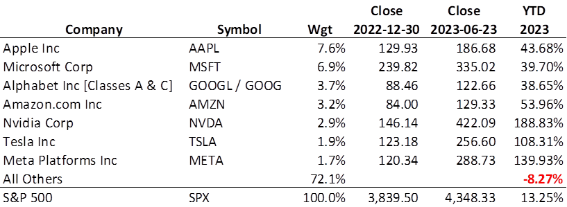
The stock market was down this week, a small correction from an otherwise good, multi-week run-up. In fact, the S&P 500 is up 13.25% YTD through June 23, 2023 (ignoring dividends). You’d never know it by looking at the Portfolio for the Ages. But let’s not look at the Royal Dividends portfolio just yet. Instead, let’s take a look at the seven largest companies by weight in the S&P 500.

Surprised? These seven companies, effectively 1.4% of the number of companies1 in the index, represent a whopping 27.9% by weight. The S&P 500 Index is market capitalization weighted and is heavily influenced by these overpriced juggernauts. The weighted average YTD price return of the magnificent seven is an enormous 68.7%. This means the remaining 493 companies are delivering a wonderful -8.27% YTD. Taking dividends into account would improve this gap ever so slightly, but let’s get real here – the S&P 500 in no way represents the broader equity market.
Unless you have decent exposure to the big seven, the market has been garbage.
The Bear Market Persists
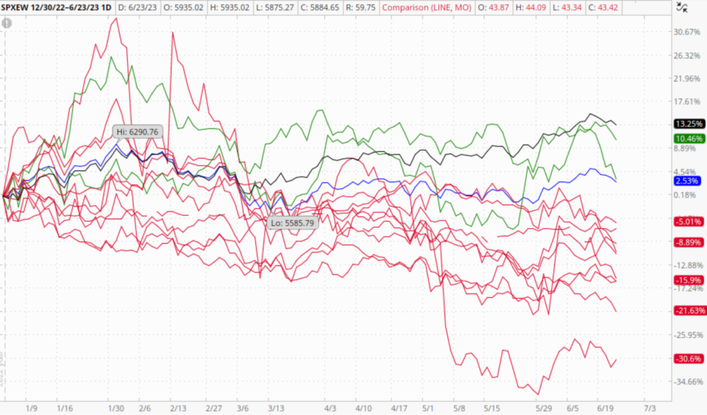
Suffice it to say, if you need to assess or gauge how the stock market is doing in general, go with the equally weighted S&P 500 Index [SPXEW]. SPXEW is up 2.53% YTD. This index gives all returns the same weight and shows a much more tempered price return and not at all indicative of the brand-new bull market that the investment media is hyping.

Note that even when weighted the same as all other companies, the returns of the big seven are still so massive, they raise the YTD return 120 basis points. Insanity.
No matter how you slice it, the Portfolio of the Ages has returned -11% since inception, and that is disappointing. Given the portfolio had a near-zero, but positive return at the start of the year, we can say the YTD return is essentially -11%, and that’s counting the impact of dividends and call option premium, too. Yikes.

The black line is the S&P 500 Index [SPX]. Obviously, no stock I select should be expected to outperform that measure, so whew, glad to see I am 0-12. The blue line is the equally weighted version of the S&P 500 Index [SPXEW]. The other 12 lines are the different stocks of the Portfolio for the Ages and the two in green outperformed SPXEW: PPG and QCOM. Ten of the 12 are in red, indicating underperformance – hey, they can’t all be winners. I chose not to pick out 12 different colors because that would be like taking all your trash out in different colored bags. It’s all garbage.
The divergence between the SPX and SPXEW began in early January and then really took off in early March. Their performance has never been this far apart and so regression to the mean is inevitable. But will the bottom 493 companies start improving, or will the big seven come back to Earth? I think you know what will happen. In fact, I can see the 493 continue their steady decline, perhaps even to a greater degree, when the Fed’s subsequent rate increases finally break more than just a few banks. Then we’ll have a more visible recession, and our favorite seven stocks will take an even greater beating – creating the convergence we so desperately seek, yet with the sad realization that it will have happened in the worst way possible.
Never think the market can’t get worse. Never think a stock can’t go lower. While a stock can only lose 100% of its value once, there is no limit to how many times it can lose 50%. Do I sound bitter? Yes. Am I bitter? Of course.
1As of this writing, the S&P 500 has 503 separate ticker symbols. However, there are three companies who have two different classes of shares listed. Alphabet Inc., better known as Google, has both Class A shares [GOOGL] and Class C shares [GOOG] listed. I chose to combine these two for my analysis because it is the same company after all, and keeping it split would have understated the overall weight of the company. The other two companies have Class A and Class B shares listed: Fox Corp [FOXA/FOX] and News Corp [NWSA/NWS].
