There has been much discussion over the past few months of whether we’re heading into a recession or are already in a recession. You might be wondering why we don’t know the answer. There is an official definition, but it is subjective in nature. The Business-Cycle Dating Committee of the National Bureau of Economic Research (NBER) officially certifies and dates our business cycles. Their definition: a recession is “a significant decline in economic activity that is spread across the economy and that lasts more than a few months.” That does leave a bit to the imagination and so economists rely on various indicators.
One common rule of thumb: If the gross domestic product (GDP) declines two quarters in a row, you have a recession. The GDP has fallen two consecutive quarters. But countering that has been the pronounced uptick in our latest jobs report. And there are time lags in the reporting of most economic indicators that adds to the confusion. There is another indicator that economists and investors alike use. It is routinely described as a harbinger in articles and the news, but it is seldom explained why it is used. Those sources typically avoid showing what it looks like. It is the yield curve.
A Picture is Worth a 1,000 Words
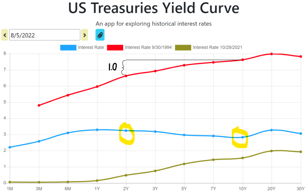
A yield curve is a smooth line connecting plotted points of bond yields (implied interest rates based on current prices), where the bonds are all of equal quality but have different maturity dates. For purposes of gauging where the economy is, or where it is going, we use the yield curve of U.S. Treasuries, the highest quality bonds. Specifically, most investors focus on the slope of the curve between a short-term maturity and a long-term maturity. Looking at the difference between the yields of 20-year and 30-year treasuries is not short vs long. The most popular comparison is between the 2-year bond yield and the 10-year bond yield, though some use 5-year and 30-year maturities, and still others use 1-year vs 10-year. The graph below gives yield curve examples at three different points in time.

I produced this yield curve graph with ease at ustreasuryyieldcurve.com.
The red line corresponds to the set of treasury yields as they existed on September 30, 1994. I chose this date, because it is the ‘textbook’ version of the yield curve, right down to the magnitude of the rates ranging from 5% to 8%. That yield curve has a normal slope and the rates are at the classic level of every bond/interest rate question I ever encountered on the actuarial exams.
Fast forward to October 29th, 2021, and we have the green yield curve. This slope is still of a normal shape though all of the yields are very low by historical standards.
The gap between the 2-year and 10-year yields is about 1.00 for those two earlier dates (the red line and the green line). You’ll see in a moment that a difference of 1.00 is a visual average going back to the 1970s.
The Upside Down
Right now, the 2-year yield is greater than the 10-year yield. The yield curve is inverted. The first inversion of this year was on March 29th. It was just barely an inversion and lasted but a few minutes during the trading day. But more recently, the curve has inverted again and by close on this past Friday, the amount of the inversion became the largest since August of 2000.
An inverted yield curve is counter intuitive. Under normal circumstances investors demand a larger yield in exchange for lending their money for longer time periods. This helps compensate for the risk of inflation, rate hikes, and other future uncertainties. But if the 2-year yield is higher than the 10-year yield, investors are expecting longer term interest rates to drop. They’re more pessimistic about the future than the present.
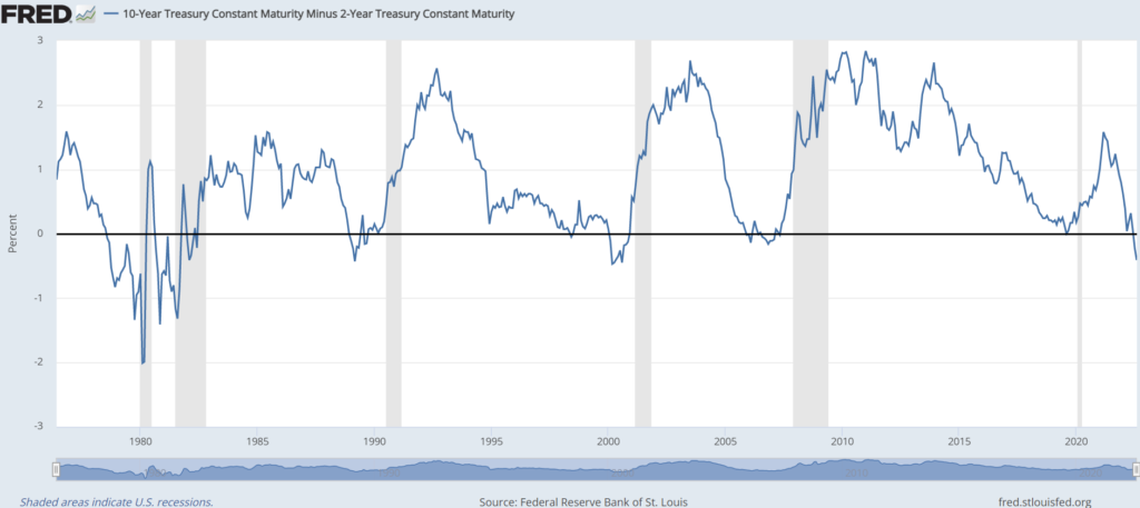
As it turns out, yield curve inversions are a very good predictor of a coming recession. An inversion has preceded 10 of the last 13 recessions. The last six are shown below.

At the source for this graph, you can see exact dates by running their mouse over the line. The shaded areas above are the recessions; you can see some are longer than others. Further, the amount of lead time between the inversion and the following recessions varies from months to over a year. The last six recessions were preceded by yield curve inversions. And how exciting is it to see that short little recession that we chalked-up to Covid-19? The curve had barely inverted just a few months before (late August and early September of 2019). How did the yield curve know that Covid was coming?? I kid. But the question we should be asking is whether that late 2019 inversion was really the one to predict the recession that we haven’t yet confirmed. If that were true, we may not have any lead time left at all.
What can we do?
My opinion? We’ve crossed the line into recession already and the indicators that haven’t yet signaled it, will in time. We’ve opened the door to the basement, and we’ve taken a step down. That’s all. We can still see the kitchen, but we can’t see past the bottom of the stairs. No one knows how far we’ll go down. Maybe we’ll see what we’re looking for half-way down the stairs on a shelf and we’ll come back quickly. Maybe we’ll have to go all the way down and turn the light on at the base of the stairs. Hopefully, we don’t have to start dragging boxes out. Hopefully, this basement isn’t really a bunker.
Whether we’re already in a recession or one is coming over the next few months, or one never comes, doesn’t really impact my approach. Let’s remember that recession is just a part or phase of the economic cycle. Economic expansion is great and is the prevailing state most of the time. But it cannot go on indefinitely.
Royal Dividends is about investing in well-managed, profitable businesses, with a history of proven dedication to raising their dividend every year. Become a part-owner of these companies! Let them worry about navigating different economic phases. Just as we have market corrections in bull markets, we can have rallies during bear markets. The last few weeks may prove to be a bear market rally and not the start of a new bull market. No biggie. If the market wants to drop another 20%, I’d rather it drop from as high a level as possible. I will follow my plan of regularly investing in attractively priced Dividend Kings with maniacal adherence and discipline, in good economies and in bad.
