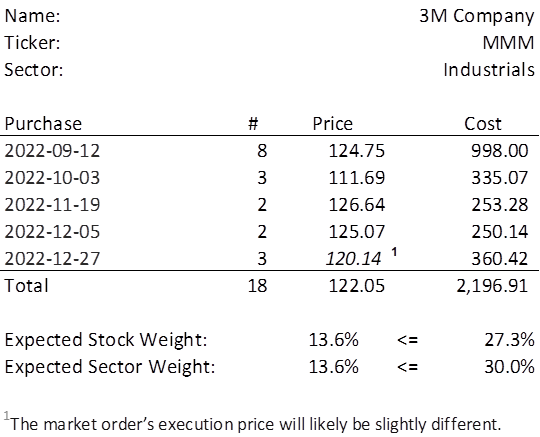
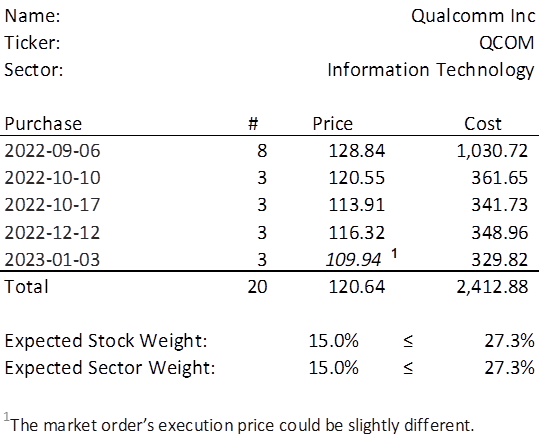
Below is an example of the table I had been including with my weekly investment.

There are three things I felt like changing with this table, starting with the one I published earlier today (below).

Did you notice the changes?
- The ‘less than or equal to’ sign was cob jobbed in haste and I never realized that the symbol was easy enough to insert in Excel and so, voilà.
- I didn’t care for the awkward wording “would likely be slightly” in the footnote. It has been replaced with “could be slightly”.
- Initially, the most exposure to any one sector for the Portfolio for the Ages was set at 30%. Though the portfolio is nowhere near a breach of that maximum, I am lowering it to be an exact 3/11 or 27.3%. Ultimately, I felt that if I am not afraid to have such an exact level for exposure to any one stock, then I shouldn’t run from such precision on having a similar cap on sector exposure. And, hey, one day there may be a new sector called Metaversery. Then the cap will adjust accordingly to 3/12, or 25%.
You may be wondering why I would post three corrections, when clearly, only #3 may one day have a material effect on the portfolio. I mean, the first is really just a formatting improvement at best and the second, nothing more than a preferential adjustment. Welcome to a world where formatting is just as important as content.
